Sophie Do
FurEver Home
UX UI CASE STUDY


Project Overview
My team and I had an idea to create an application called Fur-ever Home that would offer a user-friendly way to search for their fur-ever companion. Users would be able to see each pet's personality and needs helping them to feel an emotional connection before meeting. They could filter by what they wanted in a pet (size, temperament, breed…). Fur-ever Home would assist stray animals in shelters or animal services, help them find a home, and help keep them on the euthanasia list while spreading education about humane treatment and training of animals.
-Duration-
3 weeks
-My Role-
Interaction Design
Prototyping
Usability testing
User research
Visual design
-Tools-

The Problem
The problem to solve was the disconnect in communication between pet rescues and potential fosters/adopters. When new pets were admitted into shelters, there was a phone tag system in place to notify past fosters, but new foster or adopters would have to go in person to see available pets physically.
The Solution
A free public application that allowed you to see bios, physical and medical history, photos/videos, previous foster for reference on behaviors, tricks known, kennel & potty training– almost like a social media app. The app would provide resources for training and service animal programs.


Research
and Analyzing
Select the number to jump ahead !
THE PROCESS


Ideation
Low Fidelity
Testing
High Fidelity
Insight
We conducted a survey to target our potential users' behaviors to decide what features we would have in our application.
Have you adopted a pet before?

Would you value having access to a community of other adopters through an adoption app?

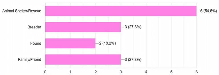
Where did you get your pets?
Affinity Diagram
After collecting data, we grouped them into relative categories. From the affinity diagram, we decided to have a forum feature for the users, who wanted to share their experiences and problems. Pictures, videos, and general information about each pet would be provided so the user could know about the potential pets before meeting them.
.png)
User Persona
To better understand the diverse wants and needs of the real people who would use our application, we created a user persona. Emma is a student from UTSA. She has a cat and a dog. She only adopts from the shelter as she does not want to support the breeder.
_edited.jpg)
Empathy Map
.png)
Hypothesis
We have observed that our users prefer to learn about the potential adoption options online before seeing them in person. Therefore, we believe that if we show users pictures, videos, and information about the ready-to-rescue animals on our application, users will feel more confident in choosing the right pet before they commit to adoption, which can save them time and avoid the frustration of traveling to places.
Competitors Analysis
We compared and analyzed ShelterLuv and Pawlytics. We found they were only available to shelters and charged a small monthly fee. This motivated us to make an app that would be free for all.

Membership
Info
UI
Aeasthetic
Mission
Functionality
Availability
$2/month to see animals in the designated partnered shelters
Too much information, seems more like a medical pet app than an adoption app
Helps shelters keep track of medical records and upload adoption and foster documents to the site
A loading issue when it comes to sending receipts after payment to adopters
Only available to shelters and their authorized personnel.
$1/month
Simple and not overwhelming
For external use where people can upload photos of dogs and describe their temperament but it needs to go into detail on the dog and their behavior, wants, and likes.
Load up quickly without much of a delay, there arent many call to action buttons
Only available to shelters and their authorized personnel.
Completely free with options to donate to certain animals that they cant foster or adopt
Modern, simple, yet still provide enough information needed
Make more personal connection between the adoptable pet and the adopter/foster parent
The site would put more emphasis on donating so there would be a noticeable CTA button on each pet page as well as an obvious linked page onb the nav bar on where to find resources for your pet
Our application will be available to shelters and he public. It will be a two way street between the two
Storyboard
To focus on problems and understand the situation, we created a storyboard of Emma that showed how she used Fur-ever Home to find her pur-fect match.

User Flow

Low-fi Wireframes
Based on the user's flows, we created our low-fidelity wireframes such as the homepage, favorite gallery, pet profile, and pages related to the adoption process, as well as making appointments for Meet & Greet.


Usability Testing Plan
-
Task 1: From the homepage, can you successfully schedule a meet & greet and navigate back to the homepage?
-
Task 2: Can you read out loud a training tip from a previous adopter in the “Furr-ever Forum”?
-
Task 3: Can you read out loud a Potty Training Tip using the app and return to the homepage?
-
Task 4: From the homepage, can you “favorite” a pet profile?
-
Task 5: Using your “favorites” gallery; can you select a pet profile, submit an adoption application, then navigate back to the homepage?
Results
We asked 6 users to do 5 tasks on the usability test. The result had high succesful rate; however, with the tasks that contained more than 1 action, the users would tend to forget to complete the second one. In the result board, I put down some red note for things that we needed to improve, and blue one for kudos that we got from the users.
.png)
Mood Board
While collecting inspiration, I realized the beauty of the moment when an animal got adopted. Therefore, I wanted to translate that energy and the excitement of a dog when they found their new home into our style guide and our Fur-everHome app. I shifted the angle of the elements in our style guide to give them the movement, and to make them look like they jumped around. Our color palette range was quite large because I wanted to represent the variety of animal breeds, I balanced it out with a soft and pastel on our nav bar. I also created a dark mode prototype that minimized to mostly black and white and a few neutral colors because I understood that not everybody liked seeing too many colors at once.


A/B Testing
I created 2 different designs for "Favorite Gallery" to try out something fun and unique. Therefore, style A had the pets in bubble-like shapes and style B was more traditional with square frames. I conducted A/B testing on both and style B was selected by 8 out of 9 people and style A only had 1 vote even though they thought style A was more playful but style B was neater and more organized.
-Style A-
-Style B-
.png)
"The other one is cute but might be messy to have different outline."
"It looks more professional and more user friendly."
"The selection looks more organized to go through."
11%
.png)
"Neater."
89%
"Other one is playful but this one seems organized."
High Fedility
-Regular-


-Dark mode-

.png)
.png)


.png)
.png)
.png)


Reflection
1. What I learned
During the process, we had misunderstandings that took some time to fix; therefore, we did not conduct the usability test on the high-fidelity. This project has taught us how to communicate effectively and the value of patience and respect for our teammates' time and efforts. I also learned to be concise with wording for user testing.
2. Next Steps
If I was able to continue on this project, I would do anther usability test on the final high-fidelity prototype to see if the users was able to complete the tasks succesfully.


